
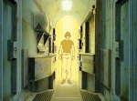
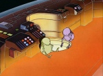
Saturn 3
Saturn 3

The Right Stuff (1983). The archetypal Egiziano Black, designed by Vincent Figgins and released in 1815; along with another of his typefaces called Antique they comprised the birth of the slab serif style. Tagline is Times New Roman Bold Italic; Avant Garde for all the rest.

“Saturn 3,” 1980


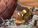
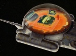
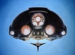
Above, an Angus McKie work used as a 1976 sci-fi anthology cover, and later featured in the Terran Trade Authority book Spacewreck. Below, a desaturated copy used on the poster for 1985 film Def-Con 4.
Thanks to Siryl for pointing this out.
Otherwise known as “Plagiarism Fucking Everywhere”.
We begin with this image:
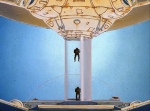
This is a piece by fantasy illustrator Les Edwards, commissioned for the cover of the 1976 Fred Mustard Stewart book, Star Child. I tracked down the origins of this image after stumbling upon the VHS…


Both of the classic Gremlins posters feature the same secret Easter egg: An image of the company’s production logo, the flying bicycle from ET. It’s on Billy’s pants button in the first poster, and on the cigar label in the second.
via /Film
This is very 80s sci-fi art, I admit, but it’s a pretty fun fact.
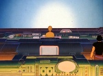

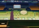

Les Maîtres du temps (The Masters of Time, a.k.a. Time Masters), 1982.
From Amazon:
“Time Masters (Les Maitres du Temps) is a dazzling animated space epic from the director of the cult classic "Fantastic Planet” and the celebrated graphic artist Moebius, best known for his work on Heavy Metal magazine.
Jaffar, a hero for hire, finds himself on the adventure of a lifetime as he races across the galaxy to save a young boy from a menacing evil. Can he stop the heartless Masters of Time from turning back the clock and stealing his home planet?”
Apparently the whole film is up on youtube: https://www.youtube.com/watch?v=K0lnl8B1k_k


